Modern web colours
Historically most peoples monitors were capable of displaying colours in the sRGB colour space (the triangle in this diagram):
")
This means that the colours displayed are limited to that in the triangle above (approximately 34% of the total perceivable colours - the bigger shape).
Recently monitors with more available colours (gamuts) have become readily available in smart phones, tablets etc.
So the question is - how does this affect colours on the web?
Let’s make a colour
We’ll start to answer that question by making a colour:
Green = 255 (Maximum)
Red = 0
Blue = 0
We’ll call this colour Big Green.
What colour is Big Green?
This is an interesting question (spoiler - the image is below). In RGB 8 bit colour there are 8 + 8 + 8 = 24 bits used to pick a colour - which gives 2^24 = 16,777,216 different addressable colours. This does not however tell us what the colours are, it just allows us to specify what percentage red, green and blue we want of the total available.
Bigger colour space
We saw that sRGB covers approximately 34% of all perceivable colours, DCI-P3 (modern displays commonly have this gamut) has 46%.
If we had two (calibrated) monitors side by side, one with sRGB and one with DCI-P3 and displayed the colour Big Green - they would show different colours!
Why? The definition of Big Green is just the most green you can display - it has no bearing to an actual colour. If you had a monitor with an even bigger colour gamut than DCI-P3 (ProPhoto RGB for example) the colour would be different again!
Can we fix this?
When creating an image it is possible to embed the colour space it was made in, into the image. This way when it is shared the next display device will know the the colour coordinates (R,G,B) belong to a particular colour space - and that corresponds to an actual colour - which will look the same on all devices.
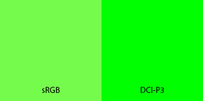
The big reveal…
The image below shows Big Green in both the sRGB and DCI-P3 colour spaces. If you have a recent monitor (and a web browser that interprets colour spaces) you should be able to tell the difference in colour. On an older monitor (or one with < DCI-P3 colours) the image will look the same on both sides:
How does this affect the web?
If an image does not have an embedded colour space on the web it is assumed to be sRGB. If you want a higher gamut image you have to embed the colour space into the image.
What about CSS colours?
CSS allows us to specify colours in raw RGB, e.g:
rgb(0,255,0)
It does not allow us to append a colour space. So definitions like these are always sRGB.
If you want to use colours in other spaces (like DCI-P3) you need to use a newer syntax:
color(display-p3 0 1 0)
This new syntax does embed the colour space.
There’s also a media-query to detect if a display device can display a colour space:
@media (color-gamut: p3) {

}
Side notes
How was the Big Green image created?
To make an image that showed the difference between sRGB and DCI-P3, I created a new image and embedded the DCI-P3 colour space. I made one side maximum green - this will work fine in DCI-P3 monitors, but in sRGB it will be scaled to max green in the sRGB colour space. On the left hand side I calculated what max green in sRGB is when converted into the DCI-P3 colour space. This way, when an sRGB monitor downsamples the colour of the image, the left side will remain untouched, and the right side should be downsampled to the same colour as the left.
ProPhoto RGB?
This space covers 79% of perceivable colours (and interestingly 100% of all colours that can come from non-reflective objects). What is different about this colour space, is that it contains colours outside the colour digram (CIE 1931) - these are referred to as imaginary colours. Big Green is an imaginary colour in this colour space.